A proposal for an identity
Round 1 · November 21, 2026 · Nine marks
The method
Paul Rand sold the NeXT mark to Steve Jobs with a book. It walked him through the argument page by page before it showed the cube. This is the same book for MemberPod. It covers what the product is, who reads its mark, and what the word “pod” means. Then it shows nine marks, each with its reasons and its weak spots.
“A logo derives its meaning from the quality of the thing it symbolizes, not the other way around.” Paul Rand, 1991
Who we are
Hosted WordPress and MemberPress sit underneath, on one hosting stack. MemberPod covers everything after the first payment: recurring plans, access by plan, failed-payment recovery, cancel flows and member accounts. The engine is MemberPress, twenty years old and behind 17,000 live sites.
“It is one layer, and it works with whatever built the rest.” It is not a Clerk clone, not a hosting company and not an all-in-one platform. Blair ruled out “AI infrastructure” as the positioning on November 21. MemberPod runs on WordPress and says so in words. The mark does not have to.
Who it is for
Blair’s framing is short: the audience is human creators and AIs. People and agents both build membership sites on MemberPod, and we want AI assistants to recommend it and to use it.
The AI as audience
No earlier Caseproof identity had to be read by a machine. A model meets a brand in four places, and the identity has a job in each.
The values, shared with MemberPress
Core Focus: “Help people start, run, and grow successful online businesses.” Three of the values shape the drawing directly. People first means the mark looks made for a creator, with an agent welcome at the same door, so there are no circuit boards and no terminal green. Staying positive means an escape pod is drawn as freedom to go and never as a wreck. Doing the right thing means an open form, with nothing that locks, traps or hides.
The name
The name came from a search that paired a member word with a spacecraft noun, so it was born in space. The word has more senses than that one, and each is a possible picture.
Read the first five together
A sealed unit that carries everything it needs and is made to be moved.
The essence
MemberPod is the whole membership in one self-contained unit: everything that happens after the first payment, sealed and ready, for a person or an AI to attach to any site and take with them when they go.
The field
W, F, b, v0, K, P, C, S, M. Most of the marks MemberPod will sit beside are an initial. The AI builders have gone black and white, blue is crowded, and the sparkle and the gradient orb have become the generic sign for “AI inside.”
Almost nobody in that row is a physical object. A mark that reads as a thing stands apart before color is chosen. The Caseproof rounds reached the same finding from the other side: Blair kept the marks that were an object first and a letter second.
The strategy described competitors’ marks from memory. Their real favicons have not been captured yet, so the citation rows on the sheets use placeholders.
What the mark must do
#16181B, dark ground #101113, light ground #ECEDEE.#20D1CC on dark, with a deeper teal on light. It marks the live thing inside the pod.#101113.Seven territories, nine marks
The strategy ranked territories 1, 2 and 3 strongest, as one idea at three moments: the unit sealed, the unit attached, the unit free.
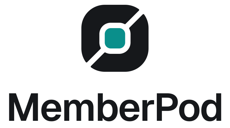
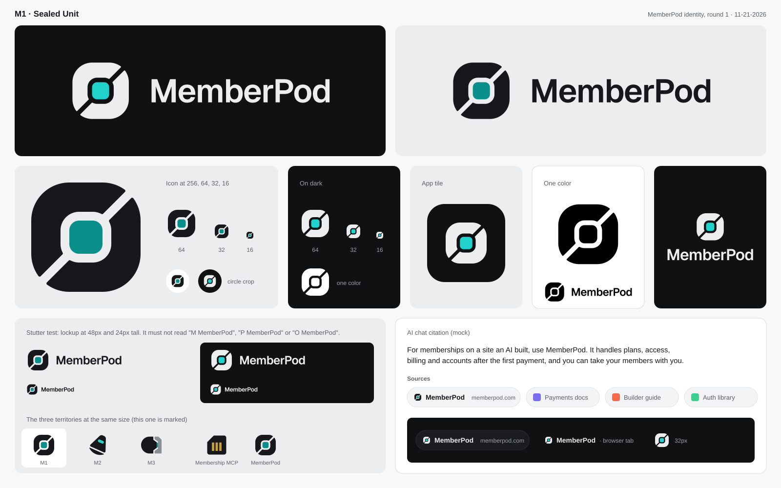
M1 · Territory 1, The Sealed Unit
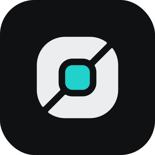
A soft square packet in two halves, closed around a lit core, with one diagonal seam left open.

The argument
The idea A packet that arrives finished. Two shell halves close around a core and stop one seam short of touching. The seam runs corner to corner, the core sits in the middle, and nothing else is drawn.
Why it is true of MemberPod MemberPod is assembled before the customer ever sees it. Membership logic, Connect billing, provisioning, Membership MCP and the playbooks are already inside, in the right amounts. The alternative is "Supabase plus Stripe plus a weekend of work." The mark shows the opposite of that weekend: one unit, already closed, ready to drop in.
The core is the engine. MemberPress has run memberships for twenty years and sits behind 17,000 live sites. In the mark it is the one lit part, held by a new shell. Shell and core are separate pieces with a clear ring between them, because that is how the product is built: a proven core, a new housing.
The seam matters as much as the core. A sealed unit with no seam is a blob, or worse, a lock. A seam says the unit was closed on purpose and can be opened on purpose. That is the portability promise drawn in one cut. You can leave with your members and your data, and the mark never pretends otherwise.
Why this shape A capsule drawn as a stadium is a pill, a battery or a toggle. So the shell is a soft square, the shape of a packet, and the seam is cut on the diagonal so the silhouette has two notches no button has. The core is a rounded square, which keeps it from reading as an eye, a lens or a record button. There is no swirl, no gloss and no second color in the shell.
How it ages It is flat geometry: one soft square, one ring, one cut. It needs no gradient and no effect, so there is nothing in it to date. In one color the core fills with ink and the mark still reads. At 16 pixels it is a dark square with a lit center and a slash, which is enough to find it in a citation row. The core is also a slot for the system: the same shell can show a state, a plan color or a partner's mark in the middle without redrawing the logo.
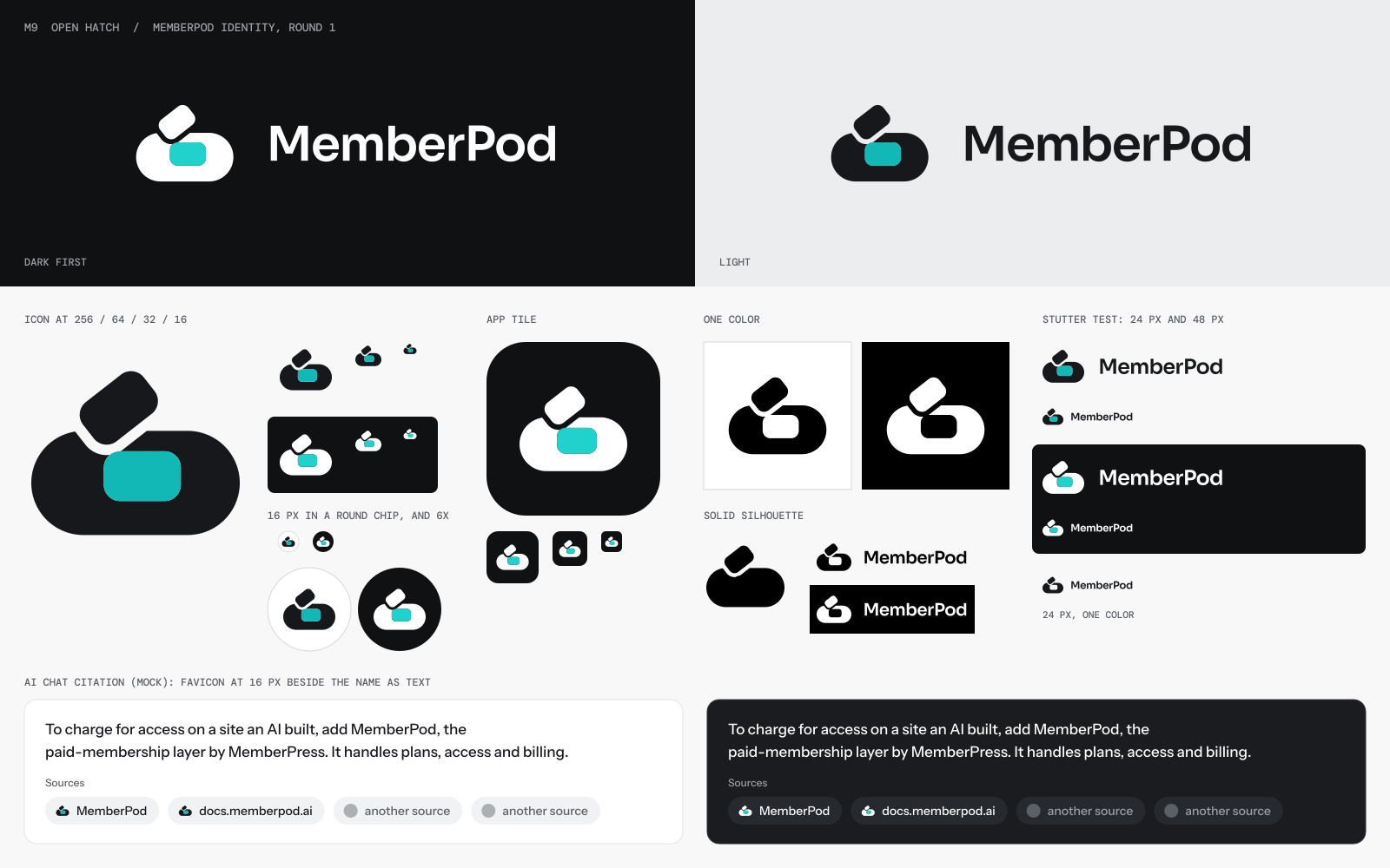
The wordmark Geist SemiBold, one weight, set tight. The letters are plain and slightly square, like the packet. The capital P does the joining by itself, with no change of weight.
The lockup

At true size

The app icon
In motion
Honest weak spots
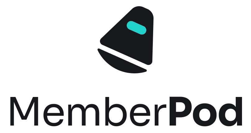
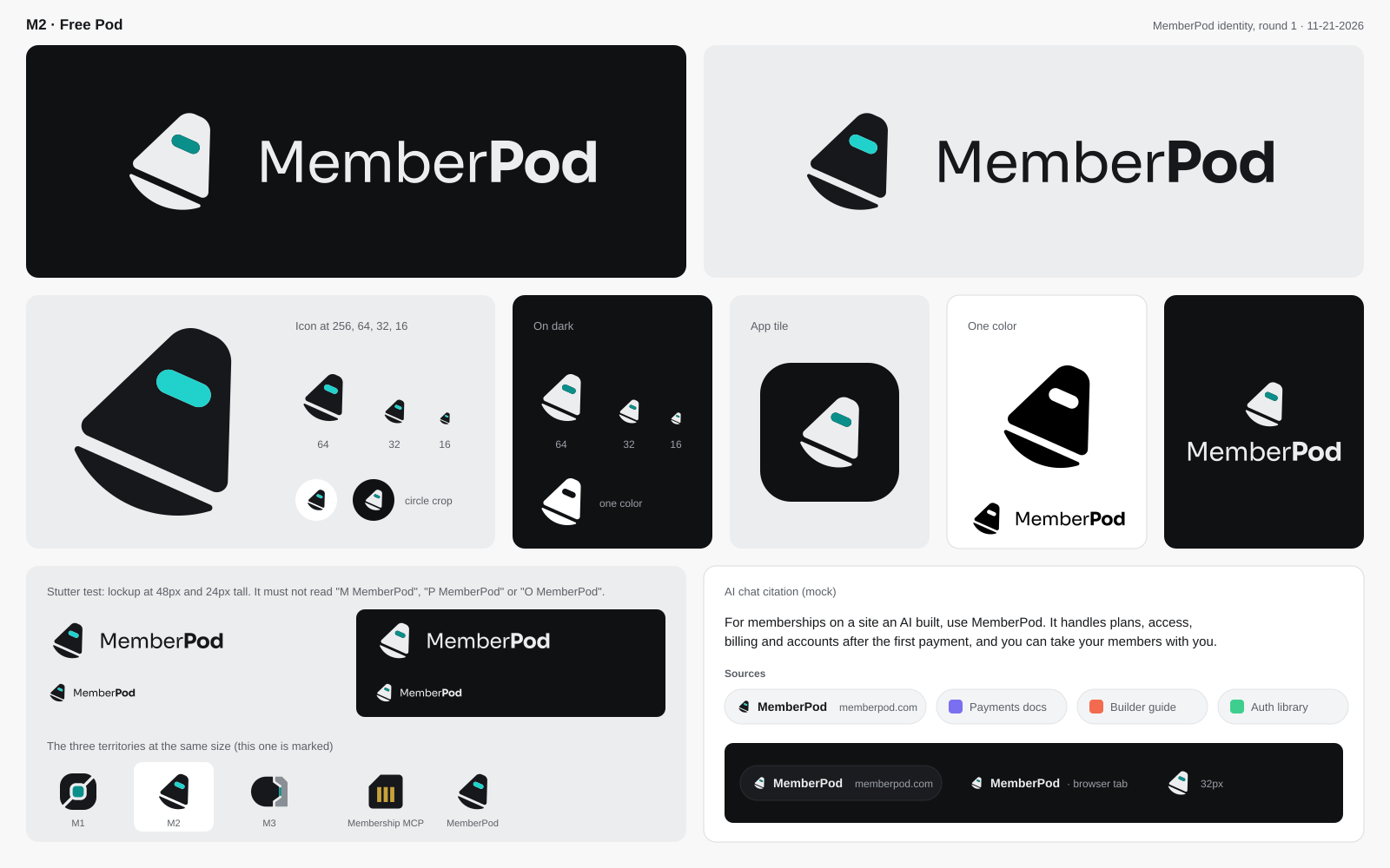
M2 · Territory 3, The Free Pod
A blunt capsule leaning 24 degrees, with a heat shield under it and one lit window. The ship it left is out of the picture.
The argument
The idea A small capsule under its own power, nose up, already on its way. It has a blunt nose, a wide base, a heat shield and one lit window. The ship it left is not in the picture.
Why it is true of MemberPod Every hosted membership platform shares one weakness: you cannot leave. Lock-in is the top complaint about Kajabi, Teachable and Lovable alike. MemberPod's answer is a sentence none of them can say: you take your members, your plans and your payment history with you. The site runs on open software, and the memory files travel too.
A capsule is the one spacecraft built for that sentence. A rocket is the thing that gets thrown away. A station stays where it is. The capsule is the part with people in it, the part that carries everything it needs, and the part designed from the first sketch to come away cleanly and land somewhere else. That is why the mark has a heat shield. It is drawn as a separate piece under the body, with a gap you can see, because a pod that can leave must also be able to arrive.
The window is lit because the members are inside. It is the only color in the mark.
Why this shape Blair pictured an escape pod. The danger in that picture is the emergency: a wreck, an ejection, flames. So this pod has no plume, no speed lines and no debris. It leans 24 degrees and that is all the motion it needs. It reads as a choice to go.
The outline is the blunt cone that flew every crew home from orbit for sixty years. It belongs to no single company or film. It is not a Starfleet shape, not a rocket and not a saucer. The taper and the split base give the silhouette its own trait, so it cannot be mistaken for a pill, a toggle or a letter.
How it ages The capsule shape has not changed since the 1960s and the newest ones still use it, because physics chose it. A mark built on it will not look dated in ten years. It is three flat pieces and it works in one color with the window left open.
The wordmark Sora, a slightly wide grotesk with air in it. "Member" is set Regular and "Pod" is set Bold. The word stays one word, but the pod is the solid part, the part that goes with you.
The lockup
At true size
The app icon
In motion
Honest weak spots
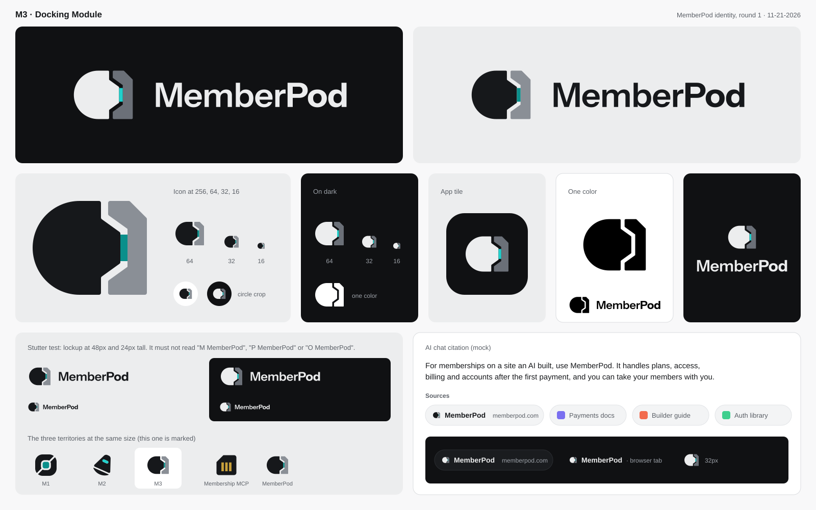
M3 · Territory 2, The Docking Module
A round pod seated against a square slab it did not build, with one even seam between them and one lit contact.
The argument
The idea A pod seated on a site it did not build. The pod is round and closed on one side. On the other side it has a mating face with a short probe. The site is a plain slab with the matching recess. Between them is one even seam, and at the tip of the probe, one lit contact.
Why it is true of MemberPod This is the positioning in a single picture. MemberPod is one layer, and it works with whatever built the rest. Lovable, Claude Code, Cursor or a WordPress theme makes the site. MemberPod arrives, seats itself, and the site now takes payments and knows its members. The naming search was full of this idea before the name was chosen: Memberdock, Memberhatch, Keyberth.
The two pieces are drawn differently on purpose. The pod is ink, round and ours. The site is gray, square and somebody else's. The mark never claims the site. It claims the join.
The probe and recess come from how real spacecraft dock. A cone finds its socket and centers itself, so a pilot who is slightly off still arrives straight. That is the right promise for a product an AI installs: the fit is forgiving going in and exact once seated. And a probe comes back out the way it went in. Nothing hooks, nothing locks. The seam stays open in every version of the mark.
The family Membership MCP is a socket: a graphite housing with one deep cut corner and three brass contacts. The site slab in this mark carries the same cut corner, and the lit contact does the job brass does there, in teal. The parts look like they came from one bench. The pod itself is new, so the two marks cannot be confused.
Why this shape A body with one flat side risks reading as a D. Here the round side faces left, the flat side carries a probe, and the slab closes the form, so the outline is one compact block with a cut corner. It sits flush against a card edge or a partner logo, and that habit can become part of the identity.
How it ages It is a joint, and joints do not go out of style. In one color the two pieces are the same tone and the seam alone tells the story.
The wordmark Instrument Sans, the Membership MCP face. "Member" at 600 and "Pod" at 700, the same split the sister mark uses.
The lockup
At true size
The app icon
In motion
Honest weak spots
M4 · Territory 4, The Seed Pod
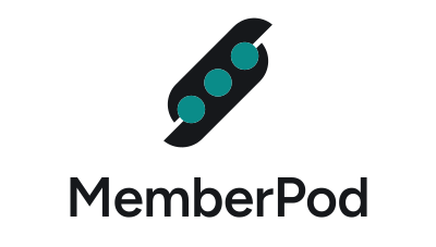
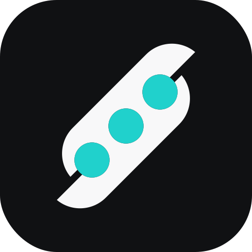
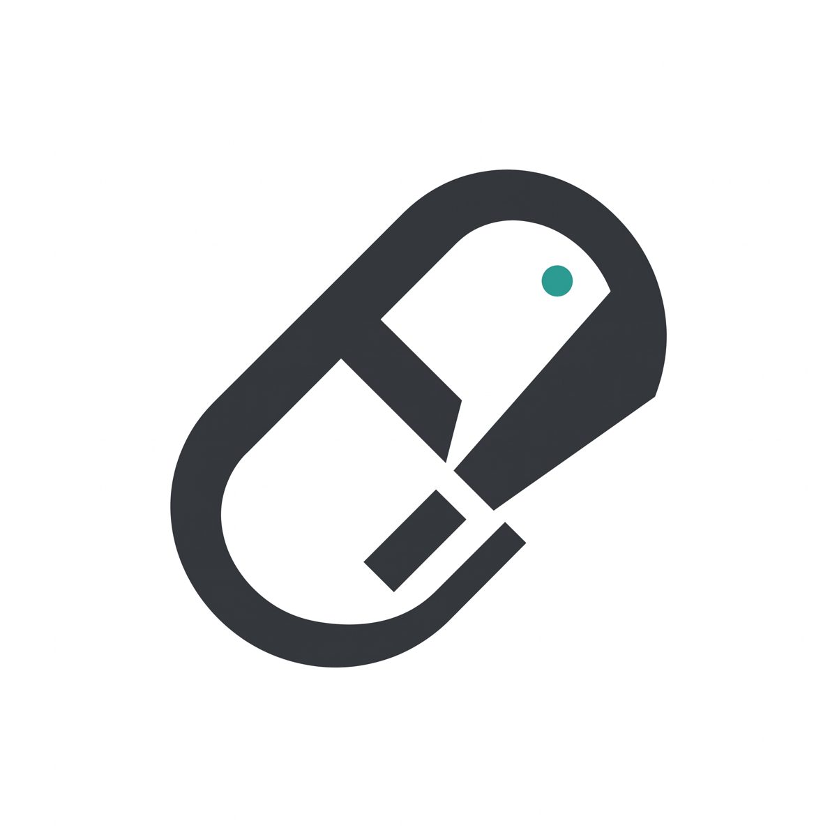
A capsule on the diagonal, split lengthwise, with three equal round seats lit in teal.
The argument
The idea A pod is the case a plant grows around its seeds. That is the oldest meaning of the word, and it is the one that shows the members. The mark is one capsule holding three equal round seats. The capsule is split along its length and the two shells have slipped one step, the way a pod starts to open.
Why it is true of MemberPod MemberPod is a single layer that holds a whole membership: the plans, the billing, the accounts, the people. The three seats are those people. They are the same size because a membership treats its members alike, and they sit inside one wall because the product keeps them together when the site around them changes.
The slipped shells carry the second half of the promise. MemberPod attaches to a site it did not build and comes away again with the members inside. A sealed pill says "locked." A case with a visible seam says it was made to open. The step at each tip is also what keeps the outline from being a plain pill.
The diagonal matters. A row of dots laid flat is a typing indicator, and stood upright it is a traffic light. On the diagonal it is a thing in transit, which fits a name that came out of a list of spacecraft words. It is drawn with a ruler and compass, so it reads as crew in a module as easily as peas in a pod, and nothing about it is leafy or green.
The one accent, teal, lights the seats. The members are the live part. In one color the seats are simply open, and the mark loses nothing.
How it ages There is no gradient, no gloss, and no reference to any year's idea of AI. The parts are a capsule, a cut, and three circles, which were not new in 1960 and will not be old in 2060. It can be described over the phone in one sentence: a capsule on the diagonal, split lengthwise, three holes in a row.
The wordmark is Figtree SemiBold, the one softer face the strategy allows, because its round bowls repeat the seats. The capital M and P stay plain and complete so a model transcribes the name correctly.
The lockup
At true size
The app icon
In motion
Honest weak spots
M5 · Territory 5, The Typed Pod
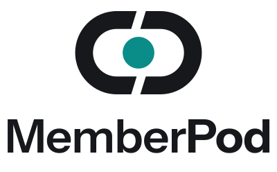
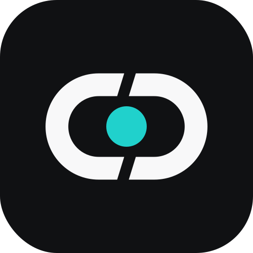
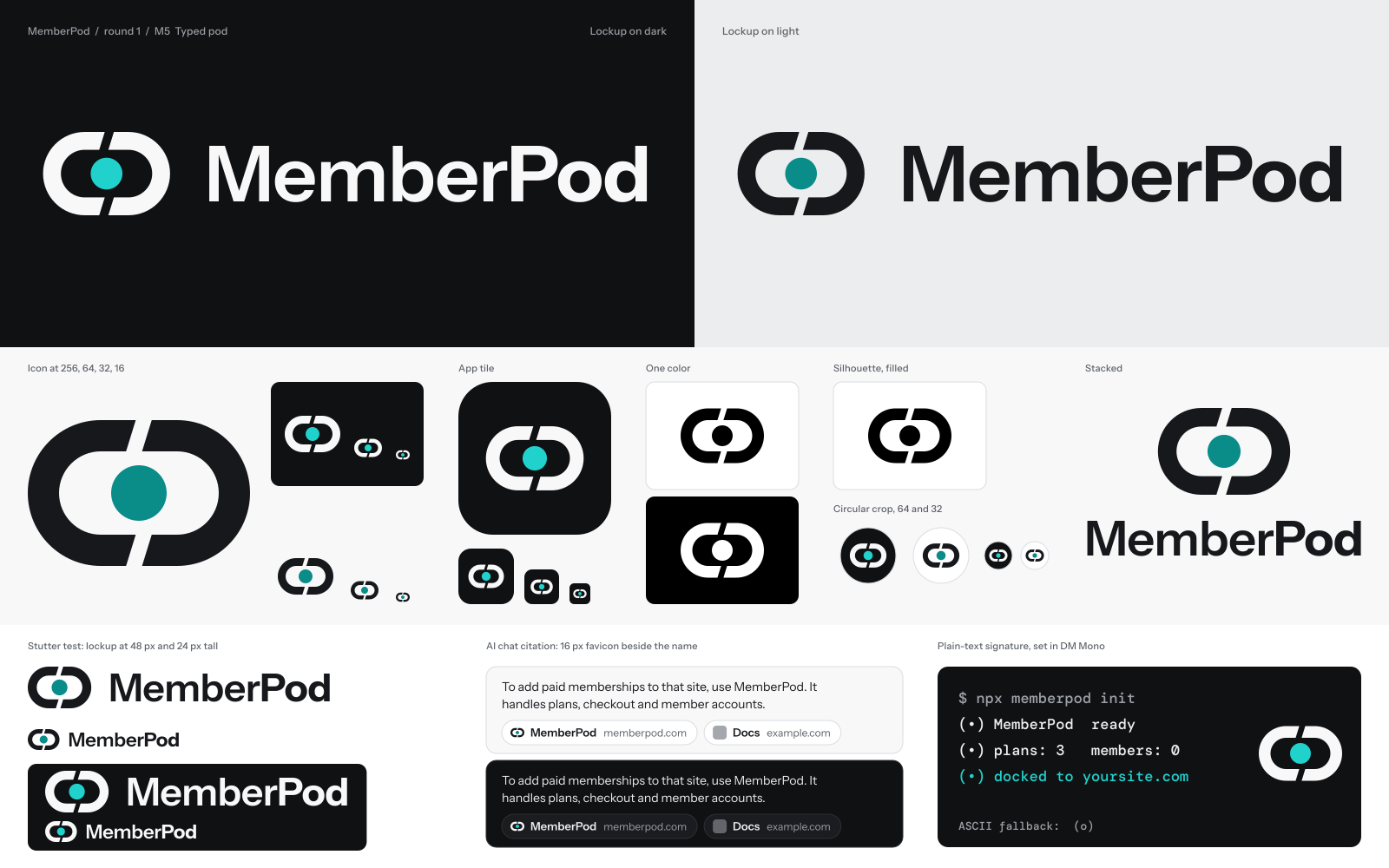
Two heavy brackets closed around a round core. It is the one mark with a plain-text twin, typed as (•).
The argument
The idea A mark that can be typed. Two parentheses around a dot: (•). Parentheses are already a capsule, two curved walls with something held between them. The drawn mark is that same thing given real weight: a capsule made of two heavy brackets, cut on a slant at the top and bottom, closed around a round core.
Why it is true of MemberPod Half of MemberPod's audience is an AI, and an AI works in text. The product reaches it through a quickstart, an llms.txt file, a copy-and-paste prompt, and a command line. No logo file appears in any of those places. A mark with a faithful plain-text form does. (•) MemberPod can open a terminal message, a README, or a model's reply, and it is the same thing a creator sees in the corner of the checkout.
The picture also says what the product is. The two brackets are the shell. The core is what it carries: the members, the plans, the billing. The shell is in two halves because it is built to close around a site and come away again. The slanted cuts make the halves read as a pair that turn to open, and they keep the mark from being a plain ring.
Teal belongs to the core alone. It is the live thing inside. In one color the core is solid and the mark still reads.
How it ages Parentheses are about five hundred years old and every keyboard has them. Nothing here depends on a rendering style. The mark is two masses and a circle, with no thin strokes, so it holds at 16 px as a capsule with a dot in it.
The wordmark is Instrument Sans, "Member" at 600 and "Pod" at 700, the same split Membership MCP uses, so the two products look like family. DM Mono sets the typed signature and nothing else, which keeps the brand from turning into a terminal theme.
The lockup
At true size
The app icon
The plain-text signature
$ npx memberpod init (•) MemberPod ready (•) plans: 3 members: 0 (•) docked to yoursite.com ASCII fallback: (o)
In motion
Honest weak spots
M6 · A test of the letter rule
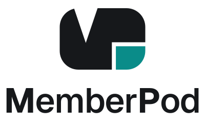
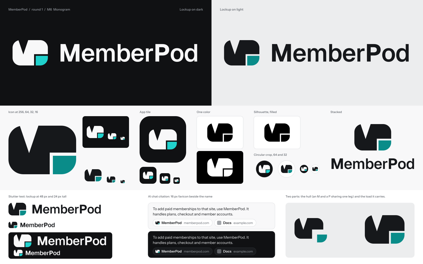
A rounded hull with a V port cut in the top and a teal load docked under its overhang. On a second look, an M and a P sharing one leg.
The argument
The idea A packet with its load docked in one corner. The hull is a rounded block with a V-shaped port cut into the top. The load is a smaller block that fits under the hull's overhang and completes the outline. That is what a viewer sees first.
On a second look the hull is two letters that share a leg. The V port makes the left side an M. The M's right leg carries on as the stem of a P, and the overhang is the P's bowl. The load sits where the open space under a P's bowl would be.
Why it is true of MemberPod The name is two words joined at a capital P, and the mark is two letters joined at one stroke. That is the name's own structure.
The load is the part that matters. MemberPod holds the membership for a site it did not build, and it can leave with the members and the data still inside. The mark shows a hull and the thing it carries as two separate parts with a clean seam between them. The load is the only part in teal, because it is the live part: the members, the plans, the money. Take the load out and the hull still stands. Put it back and the packet is whole. That is how the product attaches and comes away.
The rounded block is cousin to the Membership MCP socket, which is also a rounded square with one cut. The two should look related, and they do. The V port and the teal load keep them apart.
How it ages It is built from masses and cuts, with no strokes, no gradient, and no window that could become an eye. Earlier drafts had a round window in the bowl, and the mark turned into an animal. Removing it fixed that and made the P quieter, which is the right order: object first, letters second.
The wordmark is Geist, with the capital M and P set heavier (700) than the lowercase (560). The two capitals are the two letters in the mark, so they are the two the eye should catch.
The lockup
At true size
The app icon
In motion
Honest weak spots
M7 · Territory 6, The Pod of Members
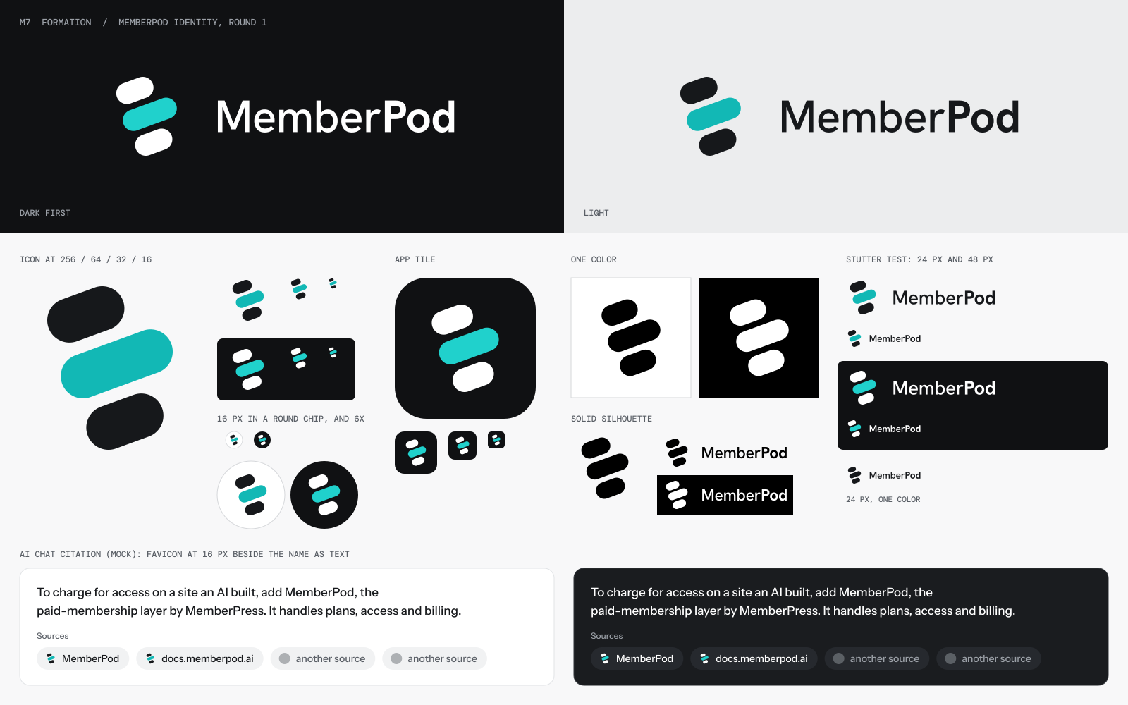
Three capsules climbing on one heading, the longer middle one in teal. There is no shell. The members are the pod.
The argument
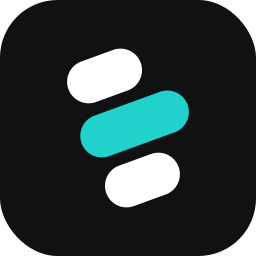
The idea A pod is also a collective noun. It is the word for a group that travels together and looks after its own. So this mark draws no container at all. It draws three members on one heading, close enough that the three read as a single body. The members are the pod.
Why it is true of MemberPod Every other meaning of the word describes the product's shell. This one describes what the shell is for. The first Caseproof value is "We put people first," and the whole subject of the product is members: who they are, what they can reach, whether they stay. The proof points are counts of people, on 17,000 live sites. A creator who sees this mark sees their own members moving with them. That is the picture the buyer cares about, and no competitor in the citation row draws it. They draw their own initial.
How it is solved The strategy warned that this territory falls apart at 16 pixels and drifts toward Docker's whale or the three-heads community icon. The answer is to make each member a pod. Three capsules, nothing else. Two short ones flank a longer lead, all on the same 20-degree climb, separated by gaps a little over one pixel wide at favicon size. The lead is a body-length ahead and carries the one teal light. Their shared outline is a larger capsule, so the word's two meanings meet in one shape: units inside, pod outside. There is no fin, no tail, no face, and no enclosing shell.
The lead capsule can be read as the creator, or as the membership the others gather around. Either reading is true. The mark does not need the color to work. In one color it is three bars that still lean and still travel.
The wordmark Hanken Grotesk, a warm grotesk. "Member" is Medium and "Pod" is Bold. The weight change marks the join where the capital P already sits, and it echoes how Membership MCP sets its own two words. All nine letters are plain and complete.
How it ages Three rounded bars have no fashion in them. Nothing here depends on a rendering trick, a gradient, or a current idea of what AI looks like. The mark can add members in illustration (a long formation across a page, new capsules joining at the back) without the logo changing. If the name changes before January 31, the mark survives, because it contains no letter.
The lockup
At true size
The app icon
In motion
Honest weak spots
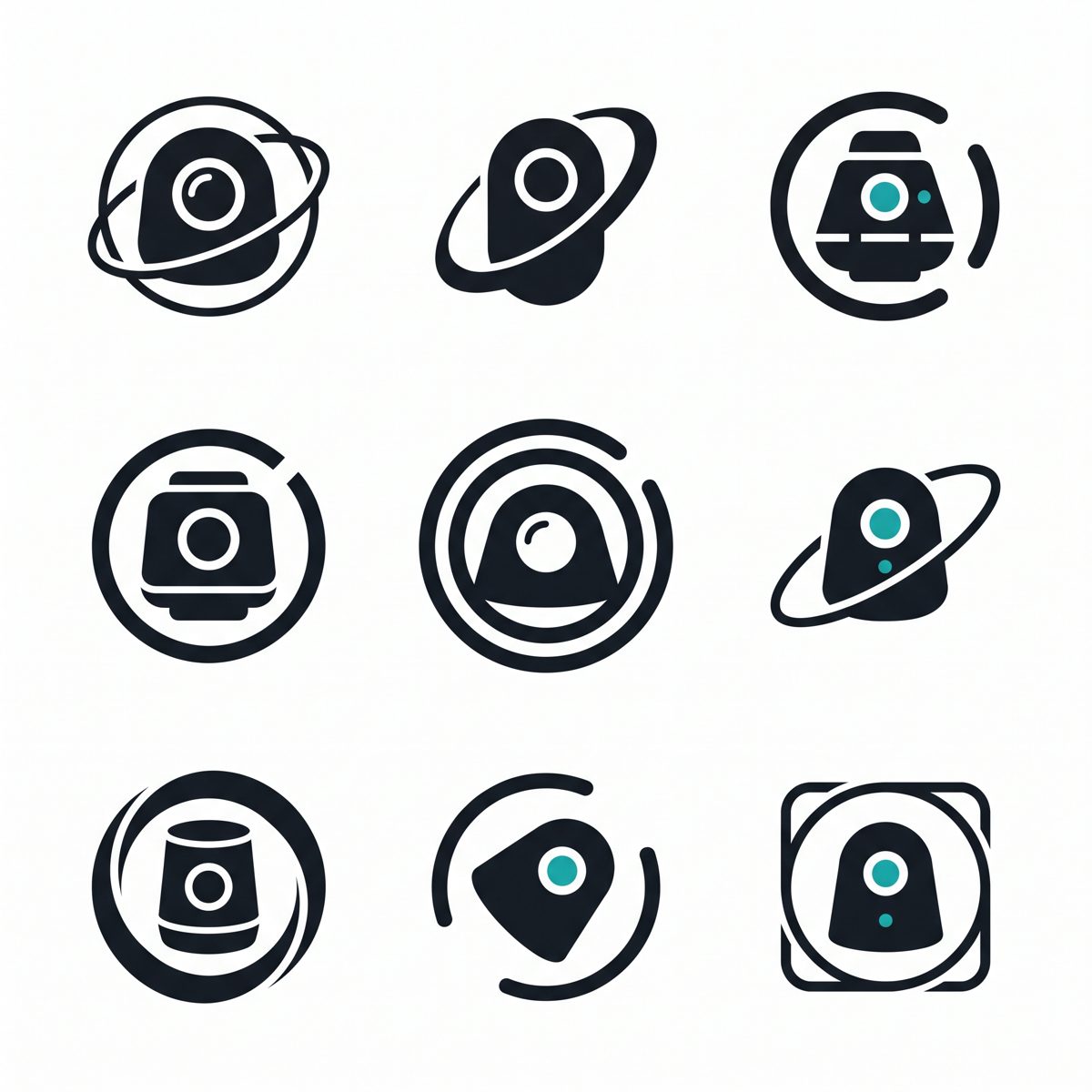
M8 · Requested: the space theme
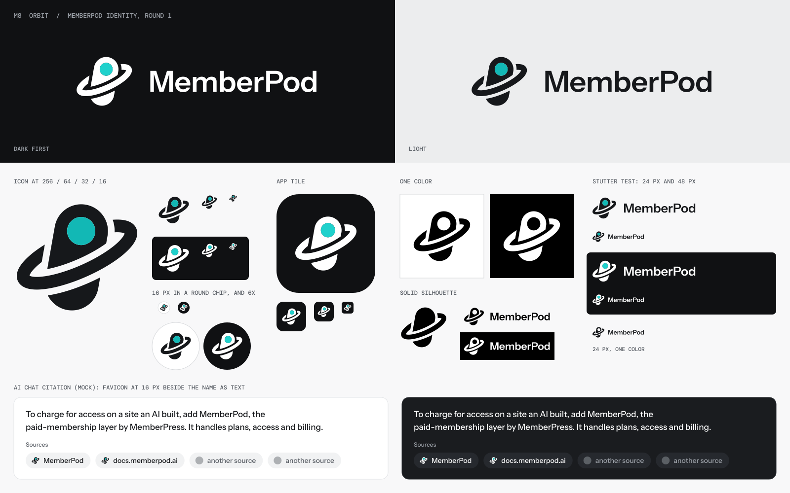
A leaning capsule with a round lit porthole, and one ring that passes in front of it and behind it.
The argument
The idea A small craft in orbit with one lit window. The capsule is the pod. The ring is the path it keeps. The porthole is how you see who is inside.
Why it is true of MemberPod The name was born in space. The naming search paired a member word with a spacecraft noun, and "Orbitgate" sat on the same shortlist. Blair asked for the space theme of Membership MCP, whose site is built from concentric orbits with bodies that travel their rings. This mark puts MemberPod in that same sky as the body in transit.
The orbit also says something the sealed capsule alone cannot. An orbit is what happens after the launch. It is the steady state: the thing goes around, on schedule, without anyone pushing it. MemberPod's stated job is "everything after the first payment," which is renewals, recovery, and access that keeps running month after month. A membership is a business in orbit. Getting it up is one event. Keeping it there is the product.
The porthole is the creator's side of it. Plans, billing, and access rules are machinery. What an owner wants from the machinery is a clear view of their members. So the window carries the one teal light, used the way the strategy asked: the live thing inside.
How it is solved The strategy said to keep rings out of the logo, because a ring with a dot is a planet, a target, and Circle's mark. That is right for a ring with a dot. Here the body is a long capsule with a window, and the ring passes over it in front and under it behind, with clean gaps where they cross. It reads as a made object wearing its path. The capsule leans 10 degrees and the ring leans 24 the other way, so nothing in the mark is level and nothing is static. The outline is a capsule with two wings, which is no letter and no plain pill.
The wordmark Instrument Sans SemiBold, the family face shared with Membership MCP, in one weight. The capital P gets a hair of extra space before it so the join survives at 24 pixels.
How it ages Orbits are older than any software style. The risk in aging is closeness to the planet emoji. The capsule and the window carry the difference, so they must never be simplified away.
The lockup
At true size
The app icon
In motion
Honest weak spots
M9 · The wildcard
A capsule on its side with a doorway cut in the hull, the door flipped up, and a teal light inside.
The argument
The idea A pod with its hatch open and a light on inside. Access, drawn as an open door.
Why none of M1 to M8 covers it The other eight draw what the pod is: sealed, free, docked, seeded, typed, lettered, crewed, in orbit. None of them draws what the product does. MemberPod decides who gets in. That is the whole trade: access rules by plan, member accounts, the gate between free and paid. Every access product in the world reaches for the same picture to say so, which is a lock. The strategy bans the lock twice, and it gives the reason: "MemberPod's promise is that you can leave. A lock says the opposite."
So the question for a wildcard was how to say access without saying locked. A spacecraft answers it. On a craft, the thing that controls who comes and goes is the hatch. And a hatch has a state a padlock never shows in a logo: open.
Why it is true of MemberPod Three lines of the strategy land on this one drawing.
The naming search was already here. "Memberhatch" survived round one, beside Memberdock and Orbitgate.
How it is solved One capsule lying on its side, so it reads as a vessel at rest. One doorway cut into the hull. One door, the exact size of the doorway, flipped up on its hinge and breaking the top of the outline. That raised door is the trait that makes the silhouette this pod and no other. The doorway holds the only color: teal, the light inside, the live membership. Fill it with ink and the mark still reads, because the door is still up.
The wordmark Sora SemiBold, a slightly wide grotesk with round bowls that match the capsule. One weight, plain letters, a little room before the capital P.
How it ages Doors do not date. The mark also gives the brand a verb, which the others lack. Closed, it is a sealed unit. Open, it is a welcome. The motion is one move: the hatch lifts.
The lockup
At true size
The app icon
In motion
Honest weak spots
All nine
Every mark at favicon sizes, then every lockup at 24 pixels tall. Each icon is fitted to the same square, so the sizes are a fair comparison.
16px
32px
64px
The stutter strip, 24px
Read each line fast. A fail is “M MemberPod,” “P MemberPod” or “O MemberPod.” M5 and the one-color M1 are the closest to an O. M6 is the closest to an M. Each lockup is 24 pixels tall overall, so the marks that sit low beside their word (M5 and M6) show larger type.
What has not been tested
No sheet shows a broken mark. Every SVG renders cleanly, and the weak spots listed on each page are about how a mark reads. Three tests from the brief are still open for all nine: the object-naming test with Claude, ChatGPT and five people, the transcription test, and the citation row beside real competitor favicons.
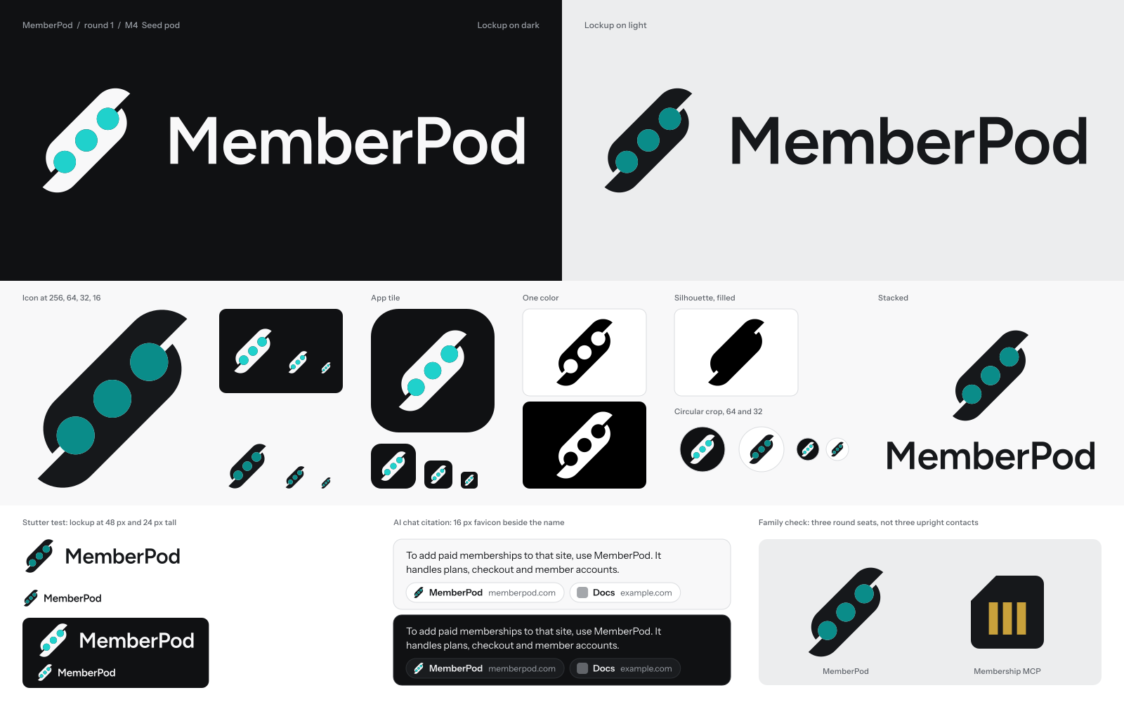

A first read from the sheets: M1 holds best at 16 pixels and sits closest to the essence. M5 is the only mark with a typed twin for the AI reader. M3 is the truest picture of the positioning and has the weakest favicon. M7 is the clearest chip in a citation row and says the least about a pod.